
H Design System
Year - 2025 Role - Lead UX/UI Developer Type - User research and testing, Prototyping
Note: Some features and research findings have been removed to adhere to privacy and security requirements.
Overview
The H Design System is a comprehensive collection of reusable components, design principles, and development guidelines aimed at ensuring consistency, scalability, and efficiency across digital products. It establishes a unified design language that enhances collaboration between designers and developers while streamlining the product development lifecycle.
The Problem
Inconsistent design practices, fragmented UI components, and inefficiencies in collaboration between design and development teams have led to a lack of cohesion across digital products. Without a centralized design system, teams face redundancy, longer development cycles, and usability inconsistencies that affect both user experience and business outcomes.
Consistency
Provide a standardized design framework that aligns visual and functional elements across platforms.
Scalability
Support growth by enabling teams to efficiently build new features without reinventing design patterns.
Efficiency
Reduce design and development time with reusable UI components and clear documentation.
Accessibility
Ensure inclusive design practices that meet accessibility standards and enhance usability for all users.
Project Objectives
Collaboration
Foster seamless communication between designers, developers, and stakeholders through a shared system.
Brand Alignment
Ensure a cohesive and recognizable visual identity across all digital products, reinforcing brand consistency and trust.
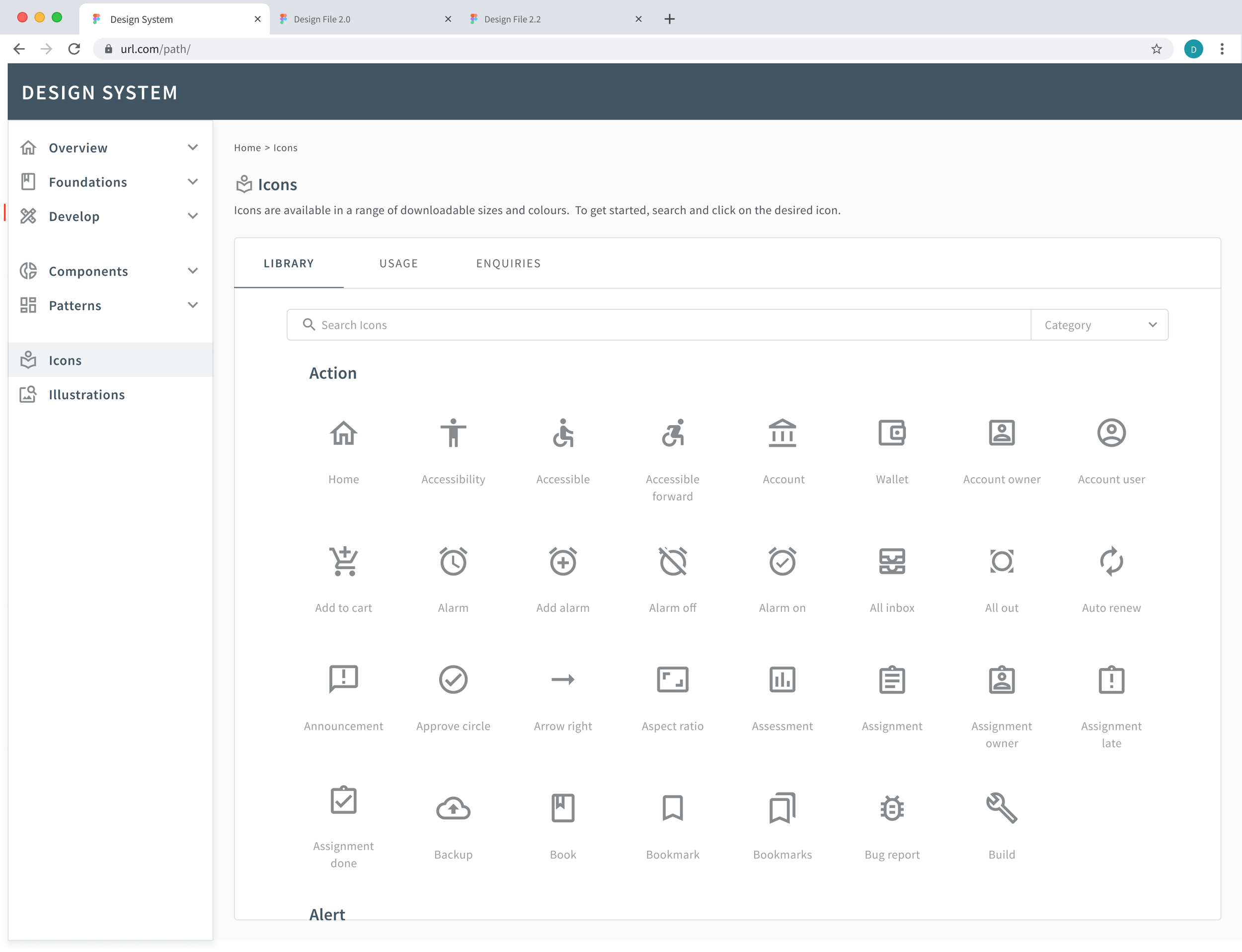
UI Inventory
Using Brad Frost’s Interface Inventory Guideline as inspiration, we conducted a 3-day audit of all UI elements across our internal digital eco-system. It helped us to identify inconsistencies, streamline design patterns, and establish a foundation for the design system.
With the audit results in mind, we created a priority list for our design system minimal viable product (MVP), and started outlining a plan for exploration and documentation of each component.
Key Components of the UI Inventory
Visual Elements
Typography (fonts, sizes, weights)
Color palette (primary, secondary, gradients)
Icons and imagery
Spacing and grid systems
UI Components
Buttons (styles, states, behaviors)
Forms (inputs, checkboxes, radio buttons)
Navigation (menus, sidebars, breadcrumbs)
Modals, tooltips, and alerts
Patterns & Layouts
Card designs
Lists and tables
Responsive behaviors across devices

Interaction
Hover and click states
Animations and transitions
Micro-interactions
Building Our Design System
During the design system audit we focused on building components, foundations and patterns within Figma, however, our initial user research identified that we would need to create a system that was approachable and easy to access for all key personas within the digital development team (product managers, developers, designers and other specialists/stakeholders).
Our initial user research included user interviews, observational studies and competitor analyses and confirmed the following hypotheses:
Users will be more likely to adopt a design system if it fits within their tools and processes.
Most users (other than design specialists) are unfamiliar with Figma and don’t ever use it for their work.
Development teams typically work independently of each other when it comes to UI design.
Accessibility and usability testing and checks are not regularly conducted on products or new features.
Smaller feature developments are often implemented without talking or working with UX/UI team as teams are looking for a faster turnover.
Different personas have different goals and ways of measuring success (i.e. Business leaders prioritise budgeting requirements, Development prioritise time efficiency and turnover, Designers prioritise usability and accessibility metrics).
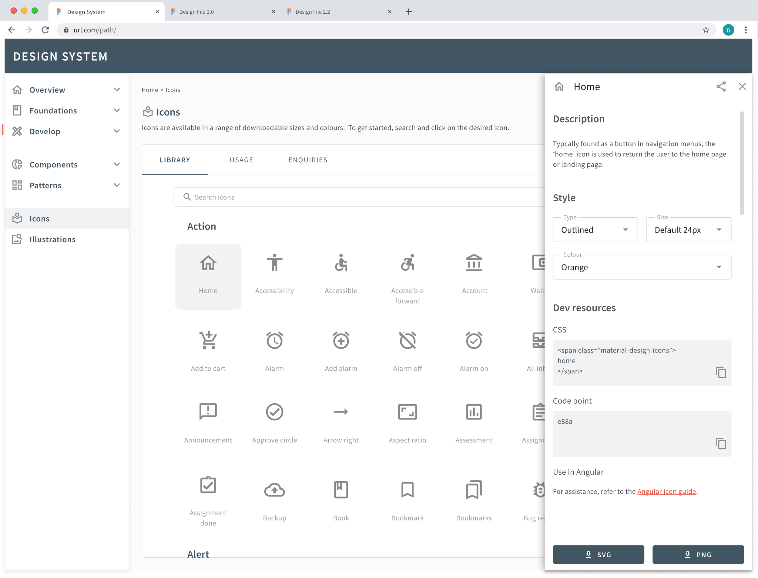
The Solution
Building on our research and audit insights, we initiated wireframing and prototyping while simultaneously strengthening stakeholder buy-in. As part of these discussions, we explored design system management tools like ZeroHeight and Supernova, which offered the flexibility to develop a custom design system solution while seamlessly integrating with developer tools such as Azure DevOps.
High-Fidelity Mockups
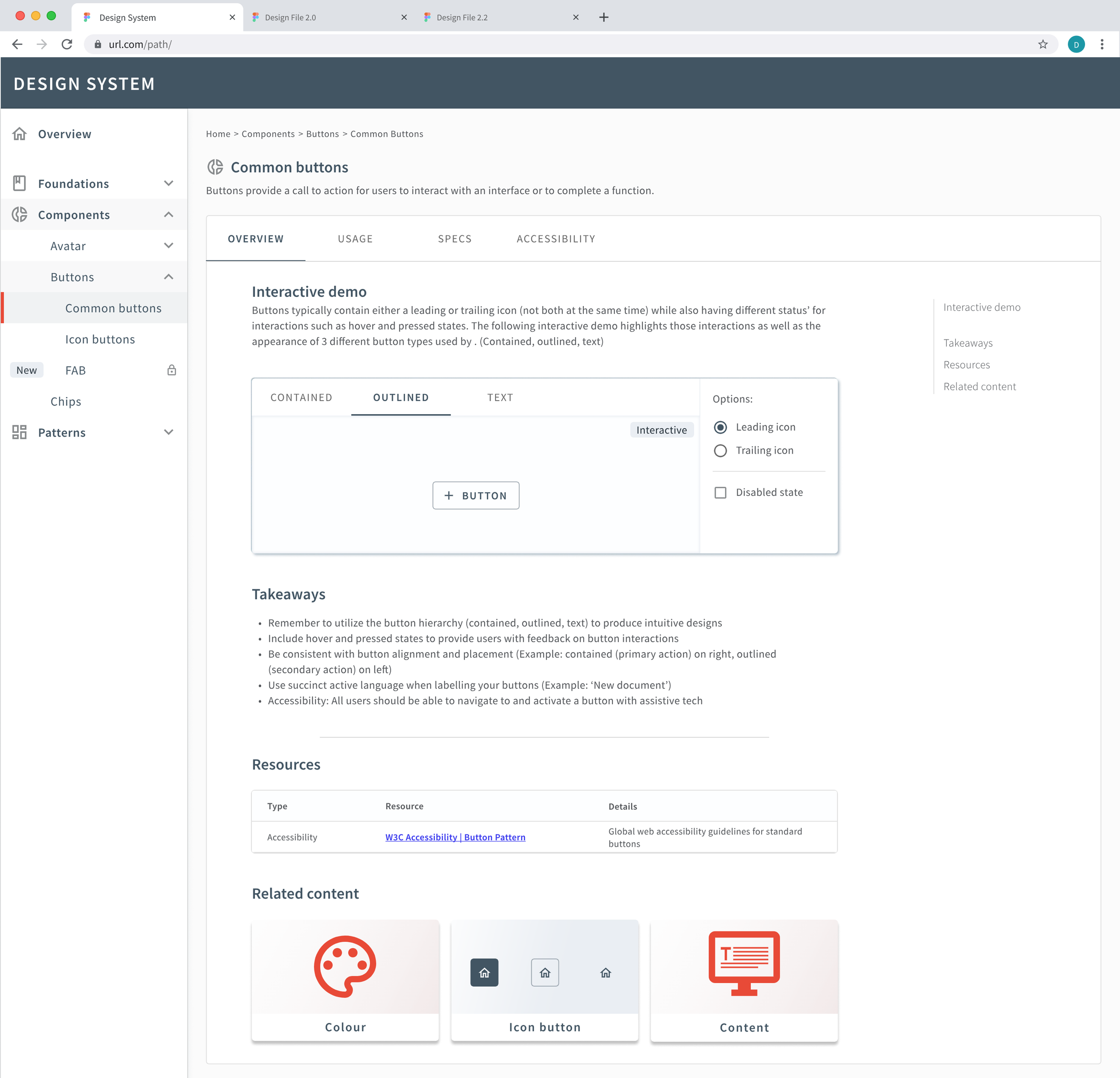
User Testing
Using our high-fidelity prototype, we conducted user flow testing to identify areas for refinement and improvement. We engaged a diverse group of 12 users—three from each key persona—who completed designated tasks within the design system. While this research does not yet account for the integrations available to end users, adjustments were made to certain user flows to accommodate these considerations, requiring further validation through retesting.
This process not only strengthened our user flow but also revealed that the volume of usage content was excessive and overwhelming, highlighting the need for optimization.
Next Steps
Based on this feedback, our next steps will focus on refining content, components, and patterns to enhance usability and consistency. We'll coordinate a workshop with Marketing to strengthen foundational elements and ensure alignment with brand objectives. Additionally, we'll begin transitioning the design system to the chosen management tool to streamline implementation. Once the Design System MVP is complete, we will conduct further testing to validate its effectiveness and initiate the adoption plan for seamless integration.